#Filters
On the left of Measure tab, filters are available to visualise the conversational paths in a specific way as well as extracting valuable insights.
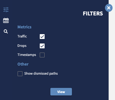
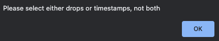
Note that either Drops or Timestamps are displayed but not both at the same time.
Metric: Traffic
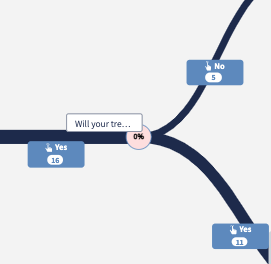
With traffic, we can get insights on the most used paths. When enabled, the thickness of the edges will change according to the volumes: the thicker the line, the more users are passing through that specific conversational path.
Also, the exact number of users passing between two nodes, is printed on each edge label. In the example below, there were 16 users before the node question "Will your tre..." and then 5 responded "No" and 11 responded "Yes".
Metric: Drops
With drops, we can get insight on where users leave the conversation after each node. The percentage displayed inside the node corresponds to the percentage of users dropping the conversation at that specific part of the conversation without engaging any further.
In the previous example, the drop is 0% which is calculated as
(11+5) / 16 - 100% = 0%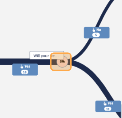
⚠️ Important note The percentage of drop is always relative to the local node.
The most critical nodes will be highlighted with a more vivid red colour (the higher the percentage, the more vivid the colour). When the percentage equals 0%, it means that no users dropped at that specific part of the conversation.
Whenever we have a No input edge, the node will appear without any percentage printed inside. This is because with no input interactions, the chatbot always move to the next specified conversational node without any user interaction, therefore percentage drop is not applicable.
Metric: Timestamps
With timestamps, we can get insights into the average time required for users to go from one conversational node to the next. When the filter Timestamps is selected, the number of seconds gets displayed inside the node, along with a red colour background.
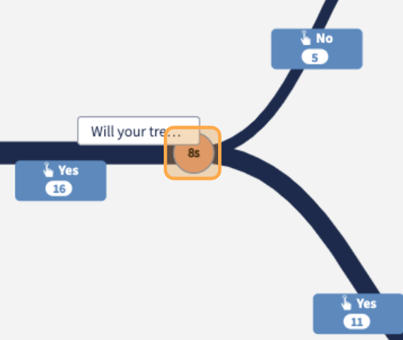
A red gradient is assigned to each node according to the value displayed inside each of them. The more vivid the red, the higher the value. This allows platform users to visually spot the conversational nodes where most time is spent on.
Also, when hovering over any conversational node, a more detailed breakdown of the timestamps is available. The total time for users to go from one node to the other, or wait time, is divided between:
-
Tech rollout, the time for the chatbot to roll out the message. Such value is normally under a second but can go beyond with functional nodes, where API calls might be performed.
-
User response time, the actual average time for users to respond.
This feature can help platform users identify critical nodes and explain their performance: it might happen to have a heavy integration with high loading time causing users to walk away from the chat, or it might be the text of a chatbot message very difficult for users to process or reply to.
Filter for a specific dates
By default, the graph is plotted considering data from the beginning of the project with all the conversational paths the users went through.
Date Range allow to filter data according to specific date interval. Through a data picker, is possible to select the initial date, From and the end date, To.
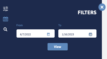
By doing so, depending on the range, the graph is expected to reduce in size, with less conversational paths.