#Edge
Create an edge
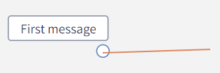
In the graph logic, the edge represents the user interaction. The user input triggers the next action of the chatbot. To create an edge, just drag the cursor from a node and drop anywhere on the whiteboard: this will create an empty target node too. Alternatively, let's drag and drop an edge connection from a node to another.
Delete an edge
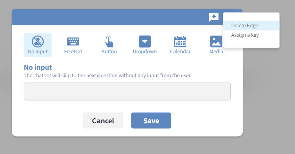
To delete a connection, select the option Delete Edge from the top-right three dots menu.
⚠️ Important note Edges can be modified in all their configurations. If an edge needs to point a different source or target node then it must be deleted and recreated.
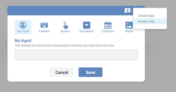
Assign key to the edge
To assign a key to an edge, select the option Assign key from the top-right three dots menu, then type the value of the key in the dialog box.
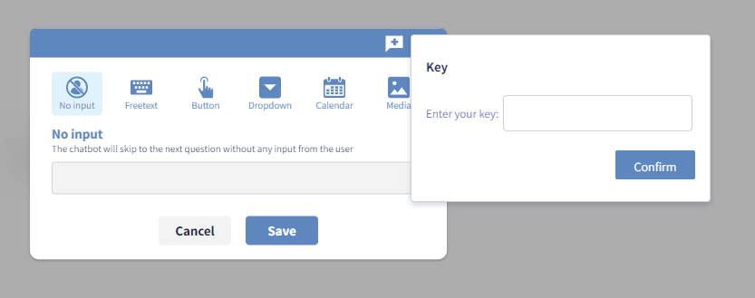
Keys are important to enrich a particular user answer with metadata and extra information.
Keys can be edited straight in the header or deleted by clicking the small blue x.
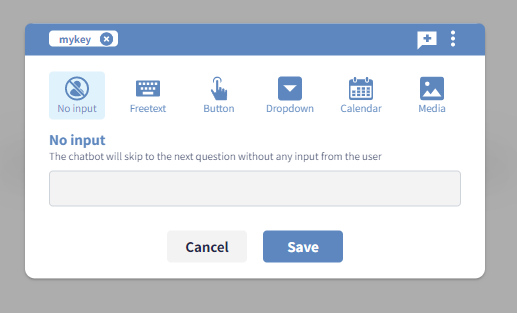
Edge types options
Edge type options are available from the edge control panel.
-
No input edge, as the name suggests, makes the chatbot move to the next specified conversational node without any user interaction.
-
Freetext edge allows the user to enter some text. When selecting this option, the chatbot will display a text input bar. The user input bar is displayed only when the freetext edge type is selected.
-
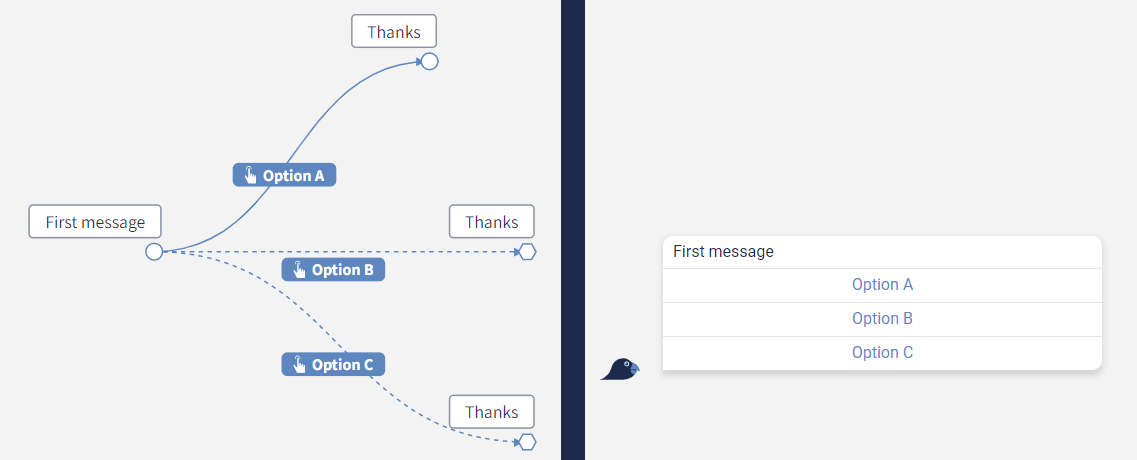
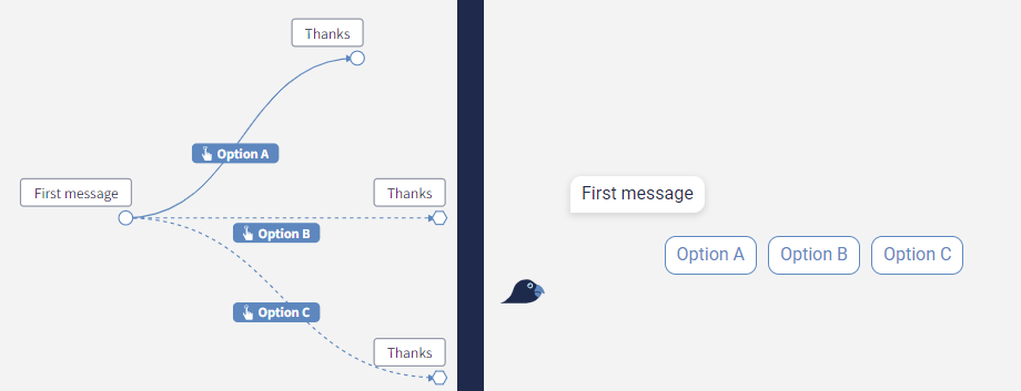
Button edge corresponds to a chatbot button. In a chatbot conversation there are often multiple buttons to pick from, which means that in the graph there can be multiple edges outcoming from the same node.
-
Dropdown edge will display a dropdown list with multiple options to select from. This module is quite useful when there are more than 10 options to select from like a list of countries.
-
Calendar edge will display a date picker to allow the user to select a date.
-
Media edge will allow the user to upload media content such as images, documents or videos.
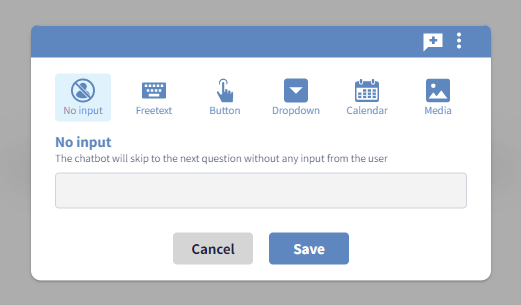
No input
The no-user-interaction edge is a technical connection that collapses two or more nodes into a single message. It's not visible from the end-user during the chat and it becomes useful it the following two scenarios:
- the process requires some function to be triggered in the background without an explicit user action;
- the conversational process presents a loop to a particular note, which can be split in two by a no input edge to reduce the receptivity of the chat.
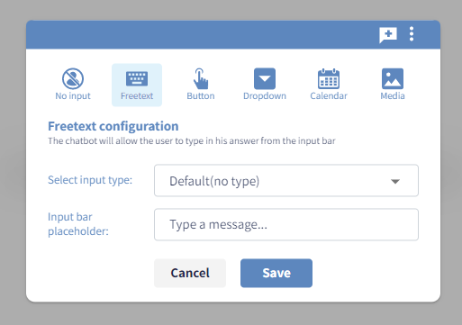
Freetext
By default, Spixii chatbots don’t allow the user to enter a message because the process-focus strategy of the conversational processes. Very often conversational processes require user free input (e.g. enter name, telephone number etc.), so the CPA platform allows such feature at request. The freetext edge will allow the end user to send a message to the chatbot at a specific point of the conversation. This means that the text input bar will appear just at the points of the conversation specified.
The freetext option is available from the edge control panel as the second item from left.
Frontend validation
Free text input fields can result in bad data input when exposed to inexperienced customers. At the same time, they are often needed in many conversational processes.
To address such a challenge, basic input validations combined with informative placeholders are available to achieve a more accurate data gathering. This features help the user to understand what type of information they are expected to enter when interacting with the chatbot.
Through input type configuration, you can specify the type of input expected from the chatbot user whilst performing input validation. This means that if the process requires a telephone number and the end user enters some text, the input will be rejected with an error message.
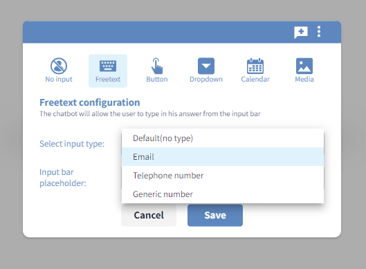
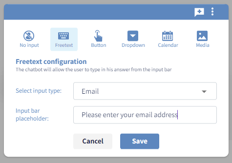
There are four different types of input:
-
Default, where no frontend validation is applied
-
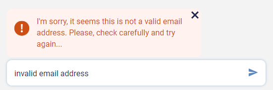
Email, to capture email contacts (the chatbot will reject anything different from a syntax such as
<name>@<domain>.<extension>, according to the RCF5322 standard) -
Telephone number, to capture telephone numbers (e.g. the chatbot will reject any input containing letters or with insufficient number of digits)
-
Generic number, to capture numbers only (e.g. the chatbot will reject any input other than numbers)
Set placeholder
On top of that, the CPA platform allows the customisation of placeholders, which means the customisation of the text displayed inside the chatbot’s free input bar. Such feature serves as to give clear guidelines and hints to the user. For example, when asking an email address, we can display as placeholder text your@email.com or Please enter your email address.
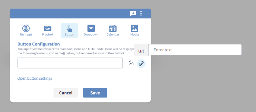
Button
One of the main ways the conversational process unfolds is through selection of chatbot buttons on behalf of the user. The button option is available from the edge control panel as the third item from left.
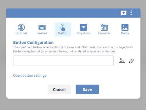
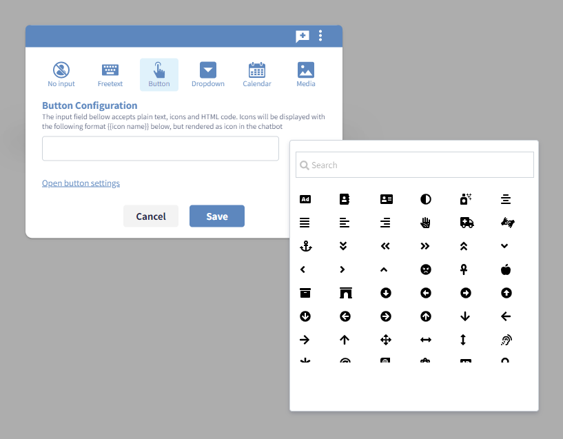
Adding icons to buttons
Together with the text of the chatbot button, it’s possible to visualise icons. Icons can enhance the button readability and also enhance brand expressivity. Best practices suggest adding icons especially when having a wide selection of buttons displayed after a question (e.g. more than 4 buttons).
Adding hyperlinks to buttons
Each button can contain a unique hyperlink to a specific URL. This option is sometimes used at the end of a conversational process. In order to add an hyperlink click on the hyperlink button and add the desired URL in the input field that will appear on click.
Changing button settings
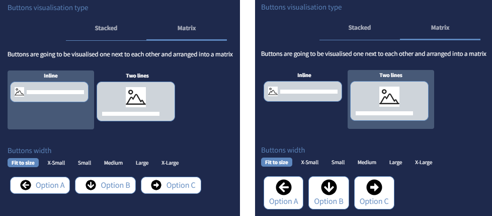
By default, all Spixii chatbot buttons are stacked buttons, which means visualised one on top of the other and attached to the chatbot message bubble.
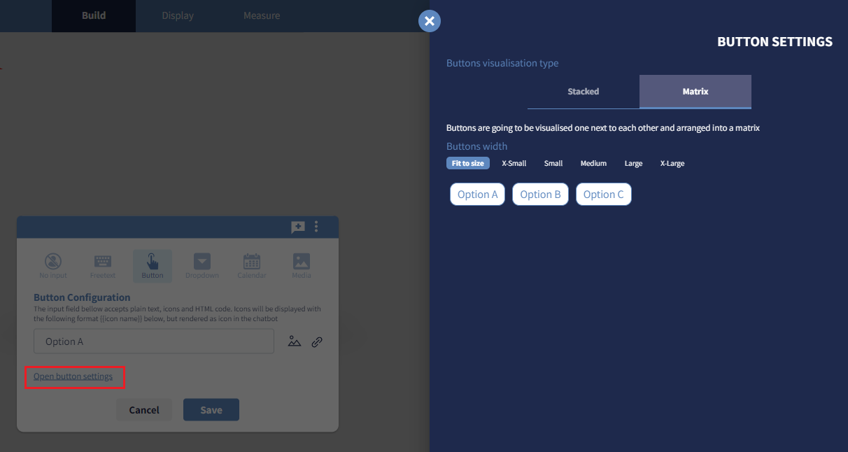
Besides standard stacked buttons, CPA users can choose a different visualisation: matrix buttons, arranged in a matrix and detached from the chatbot message bubble.
It’s possible to change the visualisation setting from stacked buttons to matrix buttons for each question containing buttons. In order to do that, click on the Open button settings button available in the edge control panel.
Moreover, the CPA platform allows changing the visualisation order of buttons. In order to do so, just drag any button and drop it in the desired position. This option is available from the button settings sidebar for both matrix buttons and stacked buttons.
For any set of matrix buttons, further customisation are available on the CPA platform for a maximum flexibility:
-
Buttons width: You can have buttons that fit to size, with a width that varies according to their content, or buttons that have a fixed width in order to give uniformity in size, independently from their content.
-
Inline or two lines: When buttons contain an icon, the layout can be arranged inline, with a smaller icon or on two lines with an increase icon size.
⚠️ Important note
In order to make effective any change made through the button settings sidebar, make sure to click the Save button in the edge control panel. Any button configuration won’t be saved if walking away from the edge control panel without saving or clicking Cancel button.
Dropdown
Generally, buttons can cover up to 5 options. If it's necessary to propose to the end user more options, then the dropdown would serve the scope. A good example is the scenario when the process requires end users to pick up their country from the list of nations.
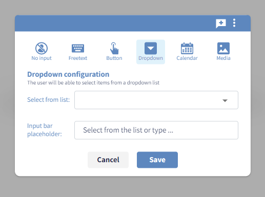
The chatbot will display to the end user the list of options selected. The end user can:
- scroll the list and click on the chosen element (normal mode)
- start typing 3 or more digits to get the filtered sub-set of items of the list that contain the characters given (autocomplete mode)
Both modes are automatically available in the chatbot.
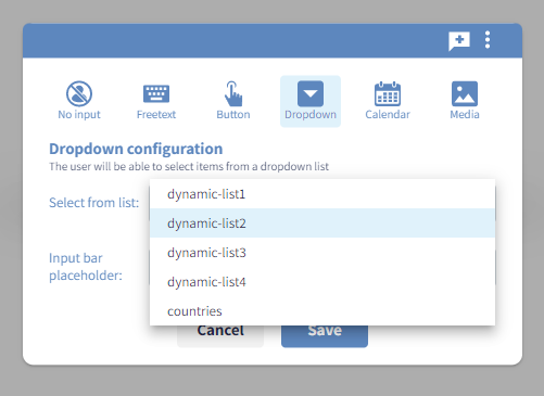
The list must be a variable from the list
dynamic-list1
dynamic-list2
dynamic-list3
...
The variable must be initialize before the dropdown connection (it could be through a functional node or a global variable) and requires the following stringified structure:
[
    {"key": "k1", "value": "Value 1"},
    {"key": "k2", "value": "Value 2"},
    ...
]
The process will be able to retrieve both the value and the key of the end user choice.
Coming back to the example of the list of countries, the variable dynamic-list1 may have the following assignment:
[
    {"value":"Aruba","key":"ABW"},
    {"value":"Afghanistan","key":"AFG"},
    ...
    {"value":"Zimbabwe","key":"ZWE"}
]
If the end user selects the last element of the list, then the variable @dynamic-list1 will have
tms: YYYYMMDD HH24:MI:SS (timestamp)
value: Zimbabwe
key: ZWE
⚠️ Important note Dropdown lists are shown in the order of their definition.
⚠️ Important note End user must select an element of the list to progress with the conversation. It's recommended to add an element Other or Not found at the top or at the end of the list that will cover the case where the end user is not able to pick up the appropriate element from the list.
Calendar
The calendar edge option allows the end user to pick up a date from a range.
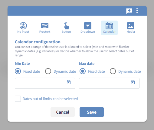
The calendar can be configure as follows:
-
Limit Min Date The lower-bound of the date range (by default:
1st of January 1900). The limit can be fixed (pick up the date from the calendar or write it with formatYYYY-MM-DD) or dynamic (referring to a variable like@myDate) -
Limit Max Date The higher-bound of the date range (by default,
31th of December 3999). The limit can be fixed (pick up the date from the calendar or write it with formatYYYY-MM-DD) or dynamic (referring to a variable like@myDate) -
Checkbox Dates out of limits can be selected With this option, dates outside of the given border will be shadowed but still clickable. This is useful to suggest the end user to pick a date within the allowed range and, at the same time, give an explanation in case of date lower or higher of the rage borders.
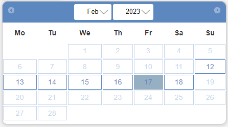
The following example shows a calendar limited between the dates 12th of February 2023 and 18th of February 2023.
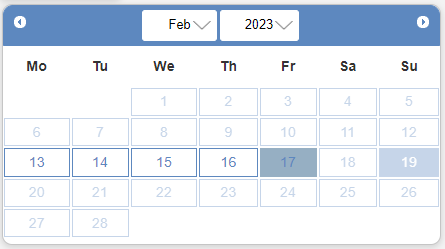
This other example shows a calendar limited between the dates 13th of February 2023 and 17th of February 2023.
The date 19th of February 2023 is out of the range, yet is clickable.
⚠️ Important note
The variable @today is initialised automatically by the system with the date of today with format YYYY-MM-DD.
It can be safely used in the Dynamic date limit options of the calendar configuration.
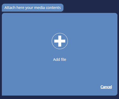
Media
Exchange of media is quite common for many processes. For example, during a Claims FNOL policyholders are often asked to share some assets to help handlers to assess the claim. Media edges allow end users to upload documents, pictures and videos during the chat. Documents will be stored into the Content Management System, which allows to securely manage the data exchange through a fully encrypted on transit and on rest.
The media upload feature is available from the edge control panel as the last item from left.
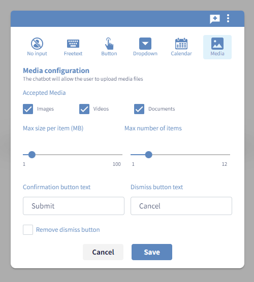
Through the media control panel the following configurations are available:
-
The accepted type of media (one or more types) among images, videos and documents
-
The maximum size per item, form 1 to 100 MB
-
The maximum number of items, from 1 to 12
-
The text of the confirmation and dismiss buttons that will appear in the chatbot to allow the user to select and submit media (with the option to remove the dismiss button)
The Spixii Content Management System accepts all types of media, including the most common:
-
PDF,DOCX,XLSfor documents -
JPG,PNG,SVGfor images -
MP4,AVI,MPEGfor videos
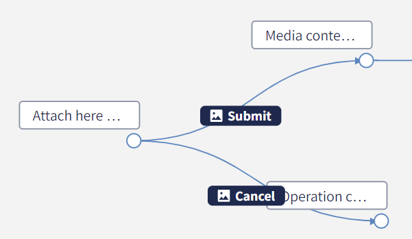
End user will be able to upload their contents by clicking on the ➕ button "Add file" or by dragging and dropping items straight in the blue box.
⚠️ Important note For security reasons, by default the media upload feature is not enabled in any new project. The first time a user will try to add the media upload module like described above (through the creation of an edge type: media), an alert window will appear with the option to automatically enable the feature at a project level.
In order to disable the media upload module for the entire project, please access the project settings from the workspace.